


Stripe vs. Linear
What do the websites of Linear and Stripe have in common?
On October 12, Linear, a planning and management tool for software product development, launched its new website, creating quite a buzz. So much so that a few days later, they even fell victim to a DDoS attack that temporarily took their site down.
But what does Linear have in common with Stripe? For years, the Stripe website has been a trendsetter in web design—now, it's likely been overtaken by Linear.
Analysis
So, what makes the Linear website so special? What is the Linear Effect? Okay, I made up that term. But let's take a step-by-step look at their homepage.
1. Above the Fold
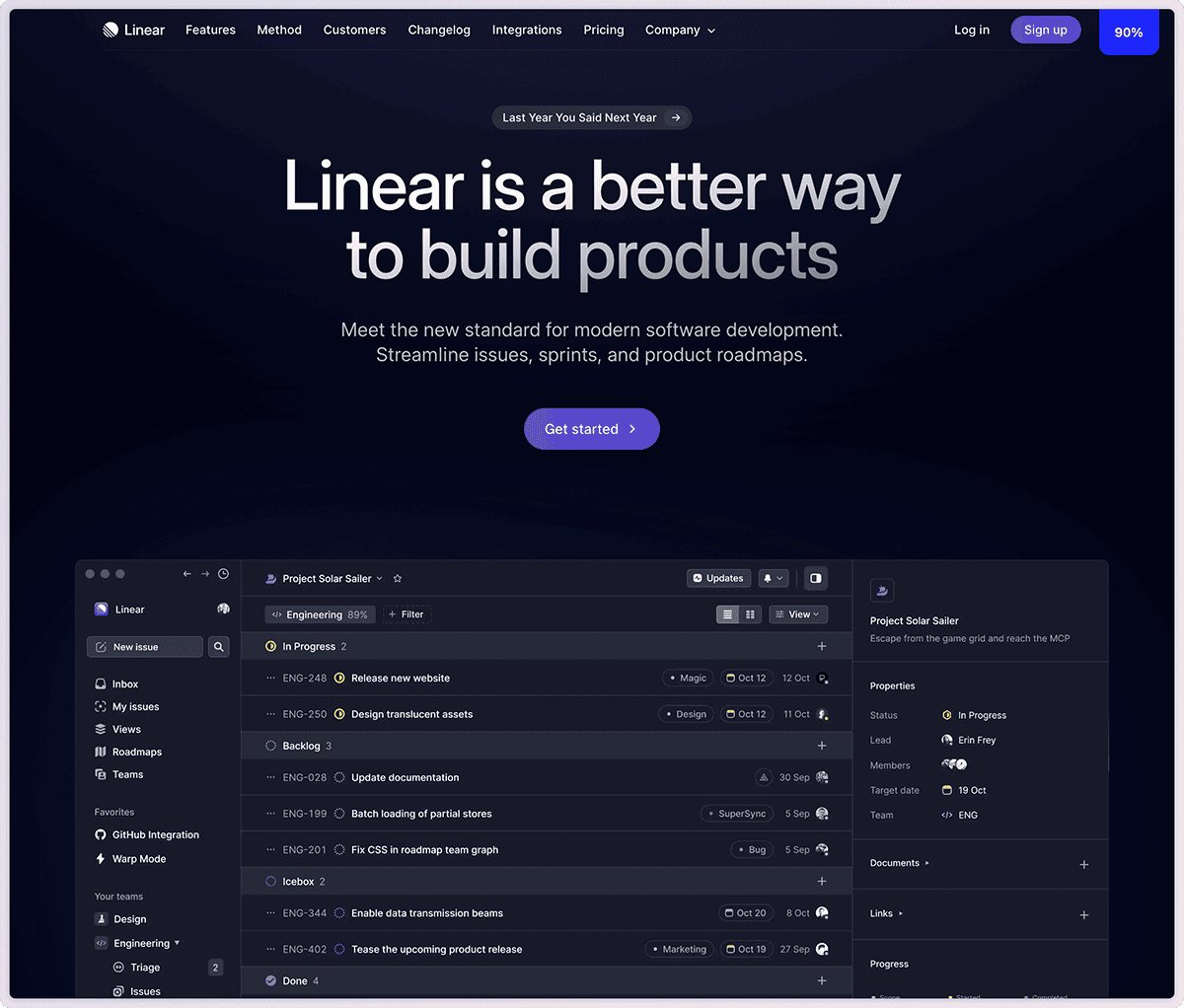
The section you see before scrolling. Super clean, a concise product description, a clear call to action, and, most importantly, a visualization of the product with subtle animations that grab your attention.
And it's cut off at the bottom—encouraging you to scroll down.
2. Logo Cloud
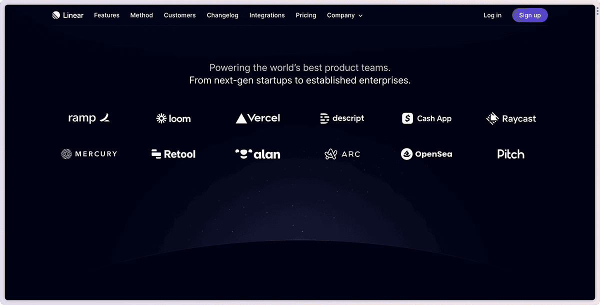
Okay, this isn't a special trick. Customer logos are placed as the second thing on the page to build trust with visitors.
Not a trick, but beautifully executed: a subtle glow in the background and dots that look like a starry sky. It subliminally creates a special appreciation for the customers listed here.
3. Feature Grid
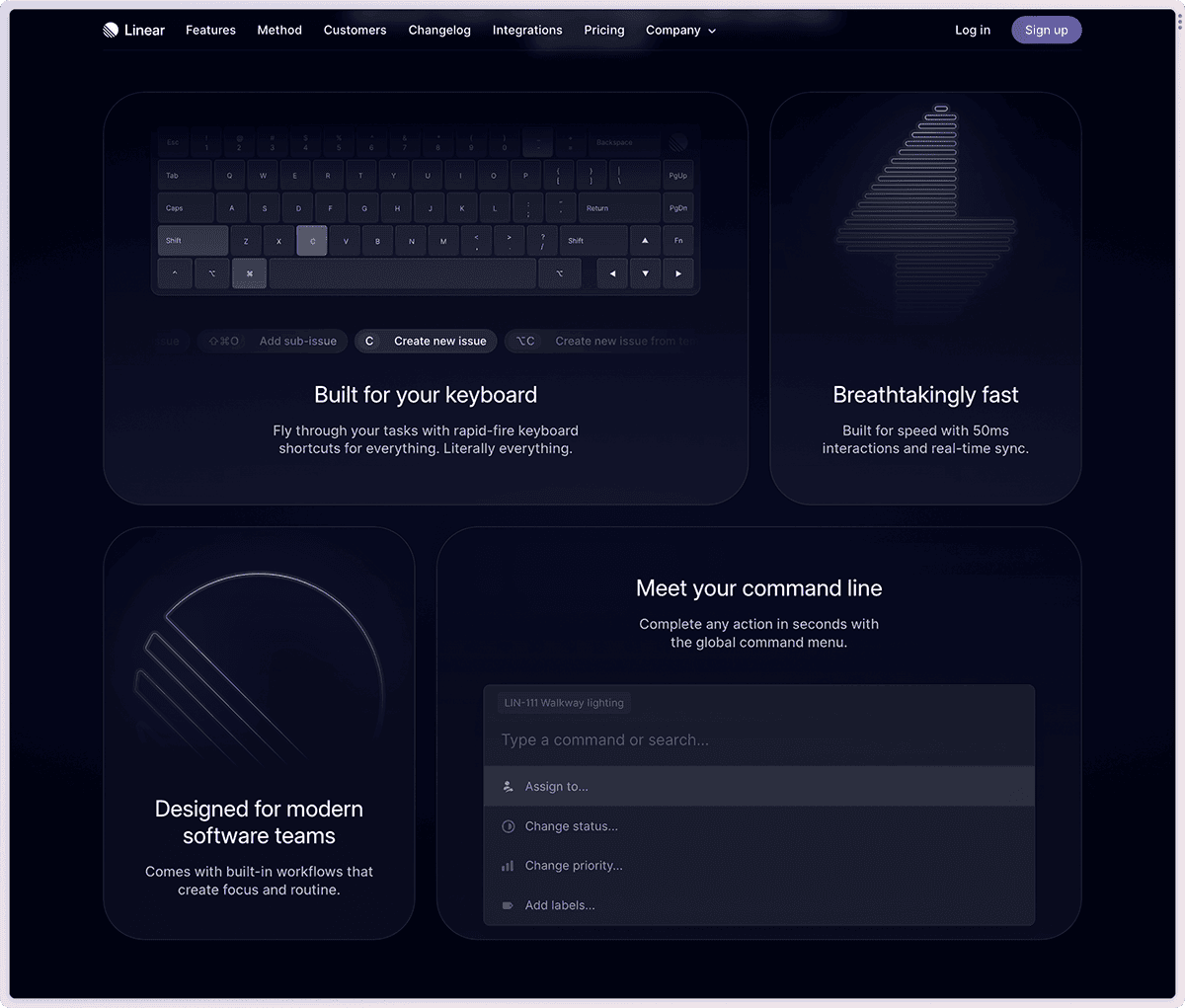
Interestingly, Linear first presents usability features rather than the tool's core functions. Developers especially appreciate performance, keyboard shortcuts, and a command-line for executing all actions.
From my perspective, it's a good decision to highlight these points upfront. And what's unique about the Linear Effect: the cards in this grid all have subtle animations or are even interactive. This not only captures attention but also encourages exploring the features. You can even try the command-line directly here.
4. Feature Reveal
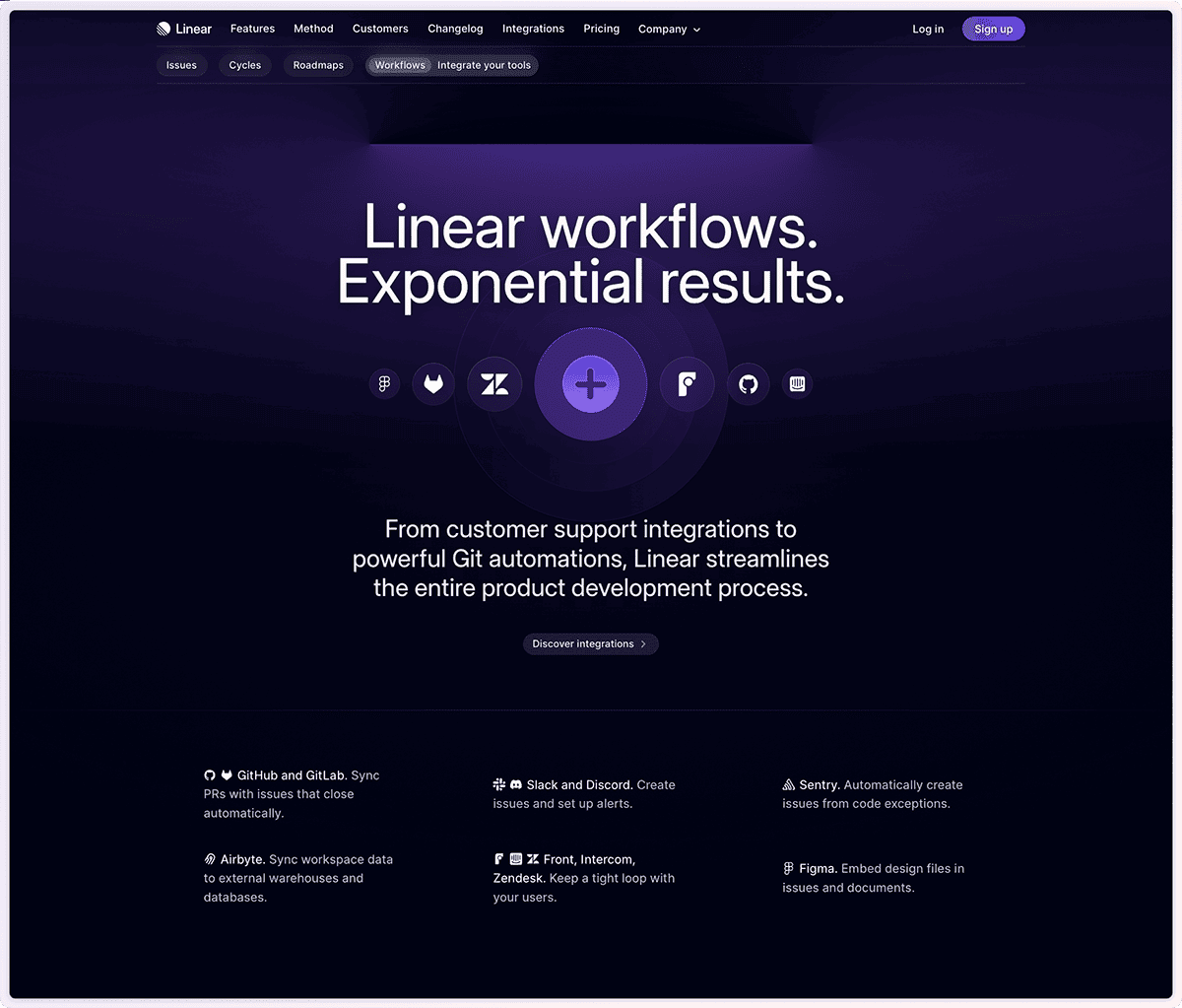
Next, the core features are thoroughly explored: issue tracking, development cycles, roadmaps, and workflows. And "explored" is meant literally. Each headline has its own colored glow that really looks like it's illuminating the section.
I've never seen this visual effect on any website before. And, of course, it comes with a subtle animation: the lighting turns on when you scroll to the respective section.
The four feature sections are not only precisely articulated but also highly detailed in design. This combination defines the Linear Effect and positions this website as a showcase example in the industry.
5. Final CTA
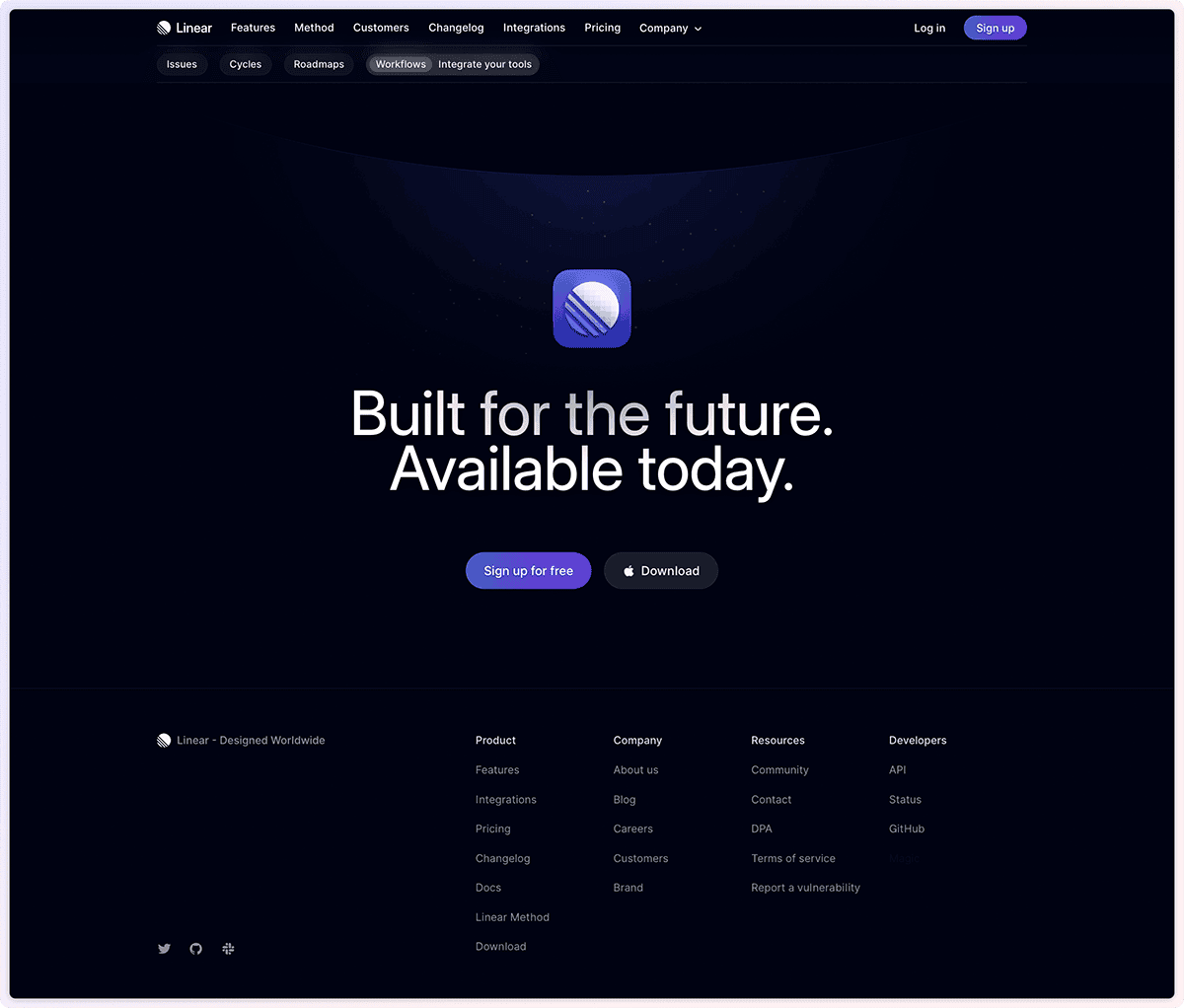
At the end of the page, there's a cool claim: "Built for the future. Available today." Of course, with a direct download button.
And if you look closely, you'll see that the section is adorned with the same glow and stars as the Logo Cloud. It's just plain sexy and leaves room for interpretation, in my opinion.
Conclusion
The attention to detail on this website is unparalleled. It makes it a showcase website and has already led to many elements being replicated on other websites. This is perhaps a kind of accolade. And the best part? This was just the homepage.
If you're into design and SaaS, you should definitely spend some time on the Linear website. Maybe you've already come across some of its elements on other websites? Be sure to share in the comments!